Display Properties in CSS: inline, block, inline-block
Types of boxes in CSS explained!


When I started learning CSS, I often got confused about these basic display properties. I don’t understand what are these and why do they even exist. Recently I was doing a course on Udemy by @jonasschmedtman and now I am very clear about it. If you also get confused about these display properties, this blog is just for you.
First, what is a display property?
A very simple answer to this is that “it is a CSS property which specifies the display behaviour of an element.“ In CSS, all the elements have their default display behaviour. These different behaviour are called types of boxes of elements. We use display property to change this behaviour as per our need by specifying the value (type of box) to the display property.
There are a lot of values for the display property in CSS3, some basics are:
- none
- block
- inline
- inline-block
Let's see them one by one
none
As the name suggests, it does not display anything. It completely hides the element like it never existed.
CSS code: display: none;
block
These elements are formatted visually as blocks. They occupy 100% of the width of their parent element no matter how long or short the content is. For example, if the parent element’s width is 400px and you write just a single word in the <p> element, it will occupy a complete 400px even if it contains a single word. It causes line breaks after the elements. They are stacked vertically by default.
Default block elements: html, header, footer, section, nav, aside, div, h1-h6, p, ul, ol, li, etc.
To make any non-block element a block element, we can use a CSS code asdisplay: block;
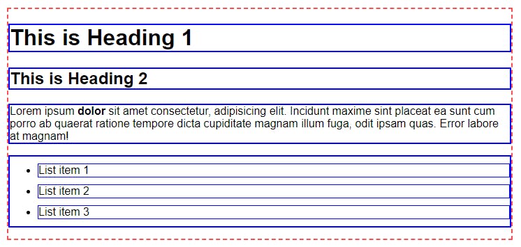
As you can see in the following image, div with a class 'container' is shown with a red dashed border. Every element inside a container (shown with blue border) means heading 1 <h1>, heading 2 <h2>, paragraph <p>, unordered list <ul> and all the list items <li> has occupied a complete width equals to its parent element div.container.
HTML
<body>
    <div class="container">
        <h1>This is Heading 1</h1>
        <h2>This is Heading 2</h2>
        <p>Lorem ipsum <strong>dolor</strong> sit amet consectetur, adipisicing elit. Incidunt maxime sint placeat ea sunt cum porro ab quaerat ratione tempore dicta cupiditate magnam illum fuga, odit ipsam quas. Error labore at magnam!</p>
        <ul>
            <li>List item 1</li>
            <li>List item 2</li>
            <li>List item 3</li>
        </ul>
    </div>
</body>
CSS
.container {
  width: 720px;
  margin: 50px auto;
  border: 2px dashed rgb(255, 77, 77);
}

h1, h2, p, ul {
  border: 2px solid blue;
}

li {
  margin: 10px 0;
  border: 1px solid blue;
}
inline
These elements occupy only the necessary width for their content and do not cause any line break before or after the element. The basic box model applies in a different way. It means, we cannot define height and width property on inline elements. Paddings and Margins can only be defined horizontally (left and right) and not vertically (top and bottom).
Default block elements: a, img, em, strong, etc.
To make any non-inline element an inline element, we can use a CSS code asdisplay: inline;.
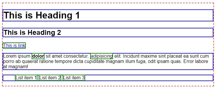
As you can see in the following image, elements like an anchor (link) <a>, bold text <strong>, emphasis (italic) <em> are shown with a green border. These are inline elements and they have occupied only the necessary width of their content. Also, we have defined the <li> elements as inline elements and you can see their display behaviour.
HTML
<body>
    <div class="container">
        <h1>This is Heading 1</h1>
        <h2>This is Heading 2</h2>
        <a href="#">This is link</a>
        <p>Lorem ipsum <strong>dolor</strong> sit amet consectetur, <em>adipisicing</em> elit. Incidunt maxime sint placeat ea sunt cum porro ab quaerat ratione tempore dicta cupiditate magnam illum fuga, odit ipsam quas. Error labore at magnam!</p>
        <ul>
            <li>List item 1</li>
            <li>List item 2</li>
            <li>List item 3</li>
        </ul>
    </div>
</body>
CSS
/* Previous code is same as before */

li {
  display: inline;
}

a, strong, em, li {
  border: 2px solid green;
}
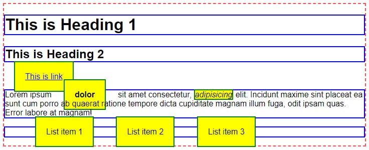
Now, let's see how the margin, padding, width and height properties affect these inline elements.
If we give padding of 10px and a margin of 20px from all four sides (top right bottom left) and also define the width and height for the <em> element,
Padding: You can see in the following image that padding of 10px has been applied to all four sides but it is overlapping with other upper and lower content and also overflowing vertically its parent container. Means <li> are overflowing <ul> and <strong> element is overflowing <p>.
Margin: You can see that margin of 20px is only displayed horizontally (left and right) and not vertically (top and bottom).
Width and Height: It does not affect the dimensions of the <em> element. It is still the same as before even after defining a width of 100px and a height of 50px.
CSS
/* Previous code is same as before */

a, strong, em, li {
  border: 2px solid green;
  background-color: yellow;
}

a, strong, li {
  padding: 20px;
  margin: 20px;
}

em {
  height: 50px;
  width: 100px;
}
inline-block
These elements look like inline elements but behave like block elements. To be more specific, the inline-block element occupies only the necessary width for its content and causes no line breaks same as the inline element but we can define horizontal as well as vertical padding and margin to an inline-block element same as a block element.
Default inline-block elements: button, select, etc.
To make any non-inline-block element an inline-block element, we can use a CSS code asdisplay: inline-block;.
Now let's see what happen if we convert all the previous inline elements to inline-block elements
CSS
/* Previous code is same as before */
a, em, strong, li {
  display: inline-block;
}
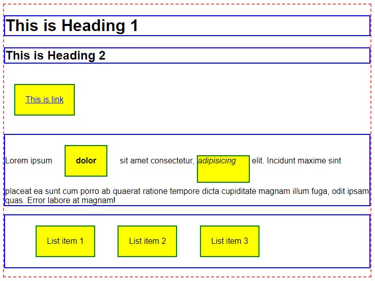
As you can see in the following image, how much vertical space is added after displaying inline elements as inline-block elements and nothing is overlapping or overflowing. Also, the <em> element got its width and height as previously defined.
As a quick example, we use display: inline-block; while designing a general navigation menu. We create a list of all nav items using <ul> and <li> and display all the <li> elements as inline-block.
You can play around with code by clicking on the following link to the CodePen -
Click here
It is really simple, isn't it? I hope you understand everything and you found it helpful. Also, I share quick tips, threads and resources about Web Development, UI UX Designing, OpenSource on my Twitter @atharvamogade where you can connect and learn with me. Thank you so much for reading. Your feedback will be really appreciated.
All the best! 🚀